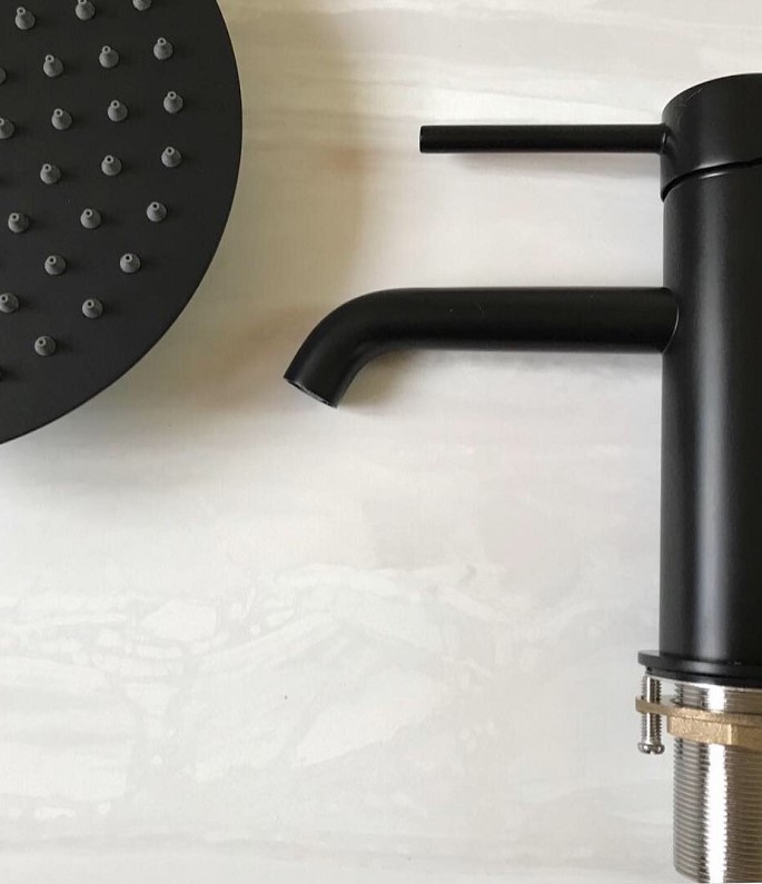
Outside of installing the central heating (we even had to get a gas mains line laid!), the family bathroom renovation was where most of our time and budget went. This blog post covers our design process for a small family bathroom and the full shopping list. At the moment, there’s only one bathroom in our house and it really needed modernisation! But it was only when we started the rip-out, did we realise the extent of the works involved. This is often the case with such old houses – you don’t really know what you’ll find until you start digging! And what we found took us all by surprise.
For those of you who are new to my House reno diaries series, we bought a pair of 1860’s Victorian houses back in April with a really interesting history. With a bit of luck and a lot of hard work, we managed to jump the housing ladder with this move and it took us just over three months to renovate one side so that we could move in and carry on with the snagging. Even though I’m ‘revealing’ the final family bathroom renovation on here – there is still some snagging to be done, but we’ll get there! This is what we started off with…
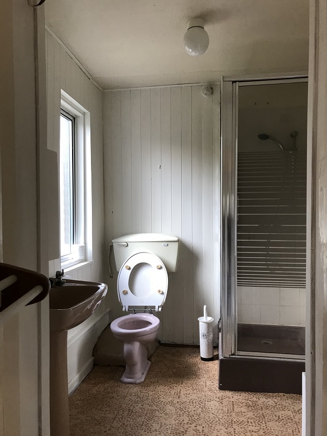
Before renovation
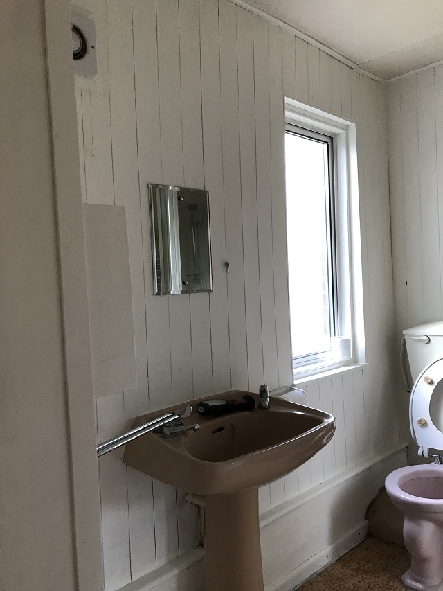
Before renovation
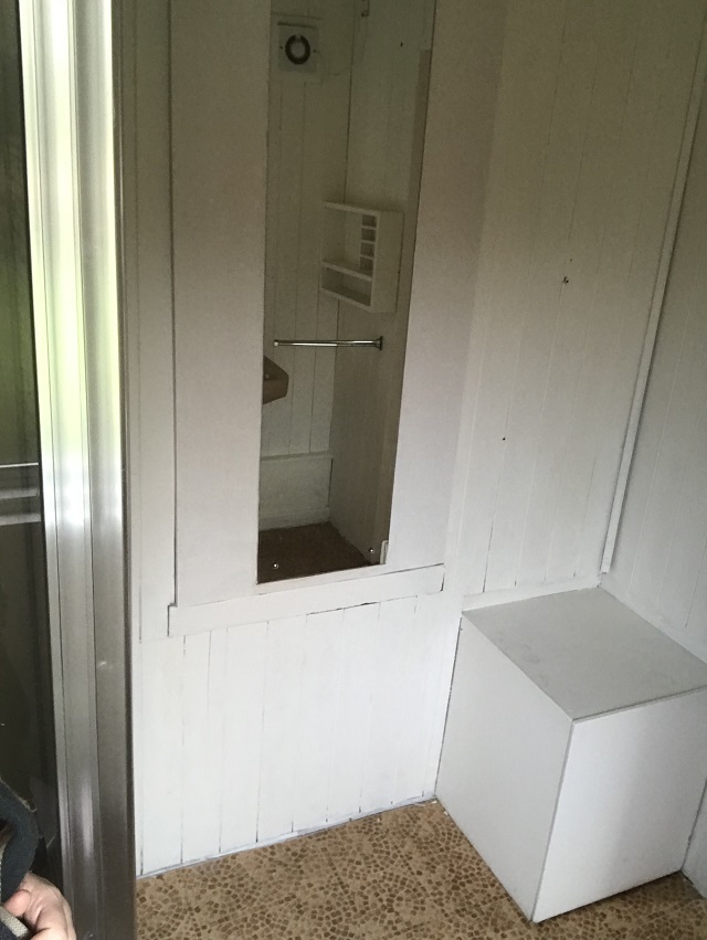
Before renovation
The Family bathroom problems and how we tackled them
Our initial issue was that the electric pump for the shower was on the other side of the wall, in what is now, next door’s utility room. Also, a shower isn’t ideal for three small children and so we really needed a bath. The largest problem was the loo wasn’t flushing correctly and so we suspected that there was some plumbing issues. On top of that, the extractor fan wasn’t in the best place (it needs to be as close to the shower as possible) and the floor was uneven. We decided to rip the whole lot out and start from scratch.
Taking out all the old wood-panelled walls revealed an old wooden door to the garden! It turns out that this was the door that one of the original owners used to bring in the milk churns from the old dairy which was once behind our house (much more history over on this blog post). We also suspect that this door also gave them easier access to the well. We know that there is at least one well somewhere, but we need to carry out a topographical survey to find out. Wells were generally right by the kitchen door so that heavy buckets of water didn’t have to be carried too far. But some houses shared a well with the neighbour – so we really can’t be sure where it is!
What did we do with the door? The answer is, we did what any discerning builder would do… and cover it back up again! The reason was two-fold, the door is an historical element to the property and wasn’t causing any structural problems. Secondly, it would have cost us further time and money to remove the door, brick it back up and re-render. We also found an original external window frame behind a mirror – I immediately knew what to do with that!
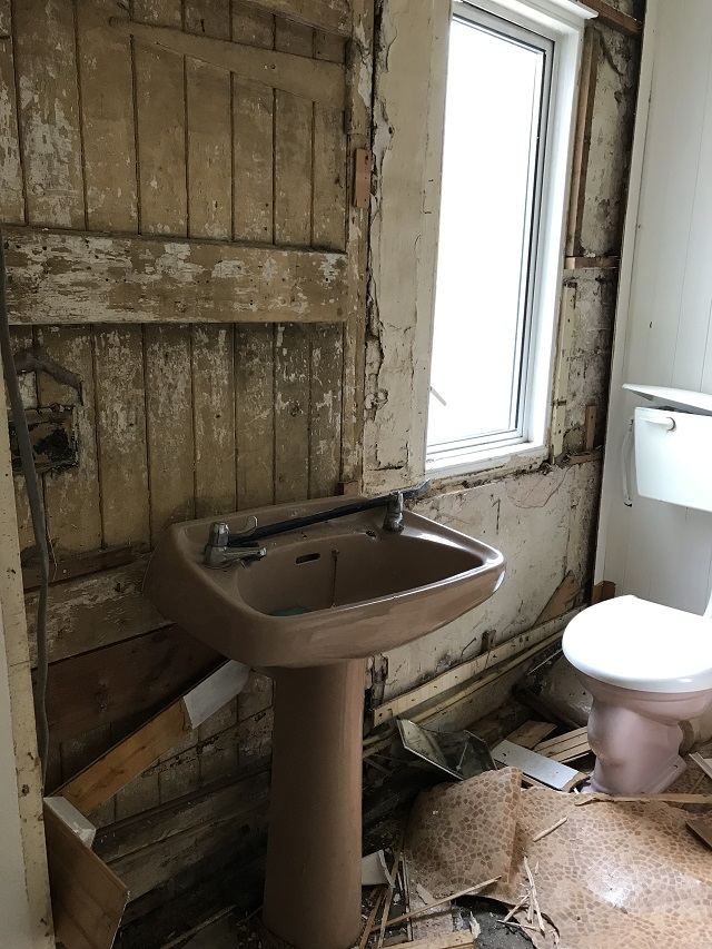
During renovation – we found an old door!
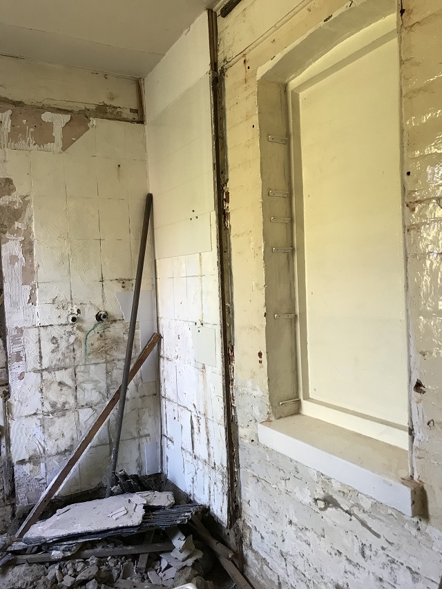
Next to the loo was a mound of concrete – we weren’t entirely sure what was going on there but we needed to get it all out to see what was going on with the plumbing. It turned out that there wasn’t so much of a U bend… but an S bend that was at the wrong angle. I don’t know much about plumbing, but from what I understand, there wasn’t enough fall. Plus the loo was in the wrong position hence the maze of pipes buried under the concrete to try and get the waste out! My Father-in-law got rid of all the old pipework and started from scratch. Now I must say, he’s not a tradesperson. He comes from a generation where they’d just roll up their sleeves and get stuck in and ‘give it a go’. And I have huge admiration for that and I’ve certainly been inspired to be braver at ‘giving it a go’!
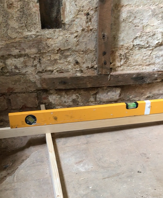
This is how wonky the floor was!
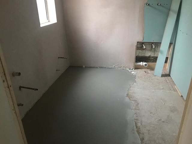
The tiler used self-levelling screed on the floor
After stripping all the walls back, we (I say we… but my Father-in-law did the vast majority of the work!) built a wooden frame and applied moisture board on the walls and ceiling. As the walls and floor were all sloping, we needed to create a square wooden box inside the room so that we’d have a clean finish when it came to tiling. For those of you wondering, moisture board is the bathroom version of plasterboard. You can tile straight onto it so we only had to plaster the bits that weren’t going to be tiled. When tiling a bath, best practice is to fit the bath first and then tile around it. This ensures that water drips down into the bath and not down the back of it. But… we went against this and tiled down to the floor. This was because eventually we hope to have a bathroom upstairs and turn this room into a utility room with a shower. So rather than doing the tiling twice, we decided to keep our long-term plan in mind.
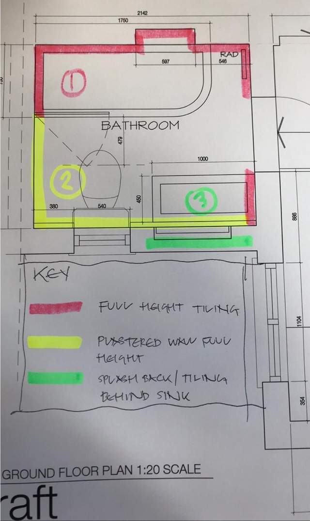
Small Family bathroom design
Space-saving bathroom design
As the bathroom is relatively small for a family of five, I had to get clever with the design. I wanted to keep it very simple and yet use some space-saving tricks to make the most of this small space. Everything in this bathroom is considered as I wanted to get the balance just right between functionality and form.
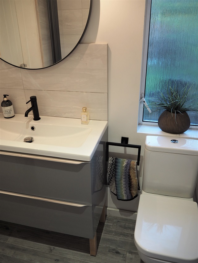
The bath
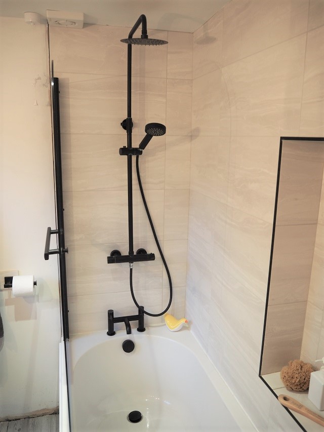
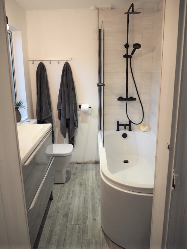
I would have LOVED a free standing bath, but they’re not ideal for leaning over to bathe the kids. Also, not ideal for showers either! I quickly ruled out an ‘L-shaped’ bath because of space and so I started looking at standard baths. I was concerned about having a bath corner as soon as you step into the bathroom though. I knew I couldn’t have the bath along the back because of the loo waste pipe. I then came across this ‘J-bath’! It’s a standard bath but has one rounded corner – this solved all of our problems! The flow works much better as you walk into the bathroom and stops us from walking into the bath!
The shower
At first, I really wanted a concealed shower (where the pipework sits behind the walls). Although this offers a cleaner and more minimal finish, concealed showers can be quite troublesome. After hearing of the problems that people have had with them, I quickly decided on an exposed shower system. It makes it much easier to fix any leaks as you don’t have to remove all the tiles to get to the problem.
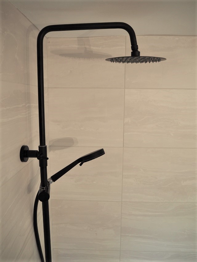
Matt black shower
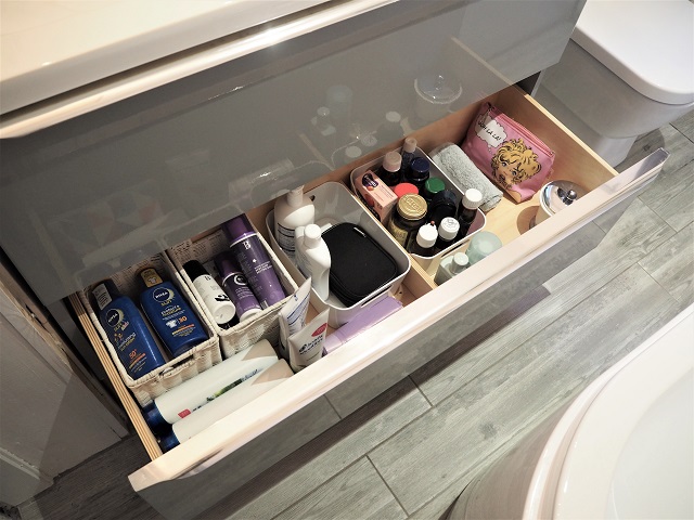
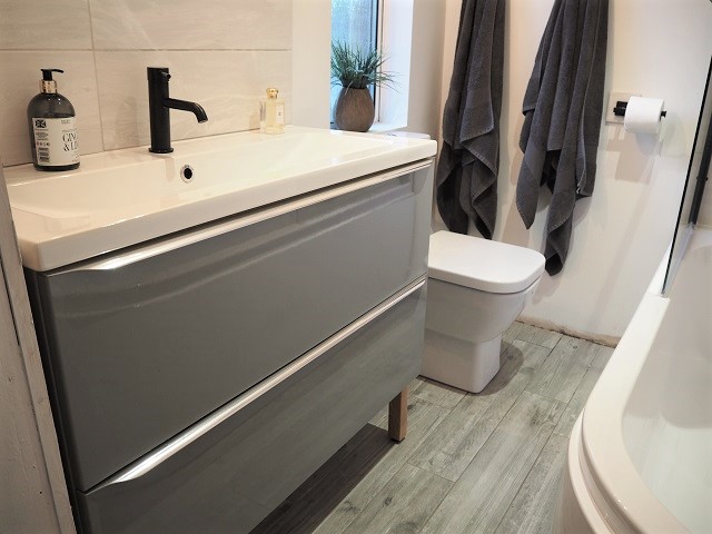
Bathroom vanity storage
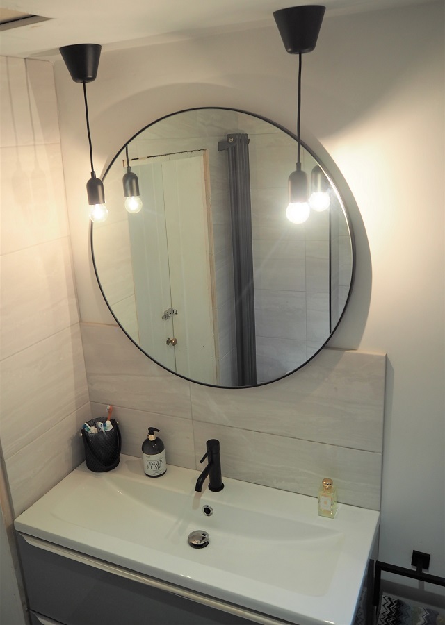
Round black bathroom mirror
The loo
You’re probably wondering why I’m dedicating a sub-section to the loo… there’s absolutely nothing exciting about it. But it’s a short projection loo meaning that we saved 15cm of space between the loo and the shower screen. The space was so tight that every centimetre made a difference!
The sink
Even though we tried to create space with the other bathroom essentials, we went the opposite way with the sink. We chose a metre-long sink unit with two large drawers underneath. When designing the space, I just had this vision of 3 kids all brushing their teeth at the same time in a rush for school. There won’t be any queueing with this sink! Plus the storage is AMAZING. It’s the only storage we have in there as I didn’t want lots of clutter on shelves making the space feel cramped. The sink can either be wall-hung or you can buy additional legs – we used both as our kids climb on everything and I didn’t want to take any risks!
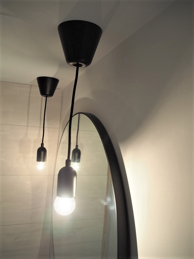
Black pendant lighting
The tiles
If we weren’t tied to such a tight budget, I would have loved some marble in here. I wanted the organic feel of natural stone, but with a matt texture and I ended up finding these budget tiles which have since been discontinued. The architect husband picked out the floor tiles as they give a nod to the age of the property and still feel contemporary. We did end up paying a little more than we wanted to for the tiler, but we went for the one who could fit into our tight schedule! Plus he was the only one that didn’t look aghast when I said I wanted black tile trims!
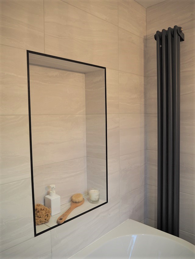
The old window makes a great shelf!
Accessories
I wanted to keep this simple, light and contemporary. I just love the matt black shower and so tried to replace anything that would have been chrome with matt black. Unfortunately, we couldn’t do this with the sink pop-up plug. I bought two different black ones but neither of them could be adapted to replace the one that came with the sink. So it was a compromise! I just love the oversized round black mirror – it bounces light around and helps the bathroom to feel much more spacious. The towel hooks at the back were ones that we already had (they are level but for some reason looks wonky to the eye!). Dimmable lighting finished the bathroom off – perfect for bubble baths or at 5am when the kids wake up and you can’t quite bear bright lighting!
We still need to fit the skirting, architraves and a blind but I’m really happy with how the bathroom has turned out. Considering we had a relatively small budget compared to the average family bathroom renovation – I think we did ok!
Family bathroom renovation costs
Building and plumbing – my Father-In-Law!
Electrics – my Dad
Tiler (walls and floor including levelling) – £600
Wall tiles – £150 Fossilised wood salt matt stone effect ceramic tiles (£10.50 per pack) from B&Q
Floor tiles – £96 Grey wood-effect floor tiles (£19.20 per pack) from B&Q
J bath and panel- £315 from Cooke & Lewis at B&Q
Black bath screen – £189.99 from Soak.com
Black bath and basin tap set – £114 from Bathshop123 via eBay
Black Shower – £139 from Bathshop123 via eBay
Black bath filler with waste – £65 from Bathshop123 via eBay
Column radiator – £87.46 from Radiator Outlet
Vanity – £200 GoodHome Imandra high gloss grey vanity sink unit from B&Q
Sink – £100 GoodHome Nira countertop basin from B&Q
Cabinet legs x4 – £60 GoodHome from B&Q
Close coupled loo – £130 Cooke & Lewis Santoro from B&Q
Black loo roll holder and towel ring – £29.99 from Soak.com
Round black mirror – £110 (PATSY) from Habitat
Black drop pendant lights – £25 each Nordlux Funk
Extractor fan – £24.99 Screwfix
Dimmable LED downlight – £19.99 Lyco
I’m estimating that our total costs (including building materials and tool hire) was under £3,000. This is hugely down to managing and carrying out most of the works ourselves – I owe my Father-in-law a LOT of roast dinners! These are also the prices I paid at the time (some included trade discounts) and so they may differ or some products may no longer be available. This list doesn’t include all the building and plumbing materials as most people only need to retro-fit during a bathroom refurb! I’m glad that we’re quite a few years off getting a bathroom upstairs now as we’re certainly in no hurry to do all that again!
Natalia xo

Great post! Thanks for sharing :)