
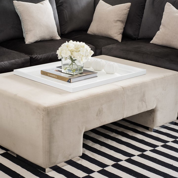
Taupe is a wonderful neutral tone which sits between browns and greys and can have a pale purple hue to it. There are many shades of taupe which make it a wonderfully versatile, but sophisticated colour which can be paired with other colours or used alone. If you plan on using taupe as the only colour in your interior design, I’d recommend using a variety of different patterns and textures to keep the scheme interesting.
Kelly Hoppen is the queen of taupe and I’ve included just a few of her top tips for a totally taupe interior scheme below – just click on each of the images below to find out more about the items featured.
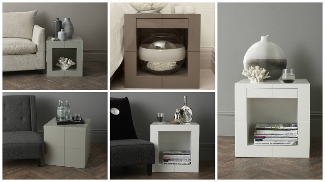
The drawer cube
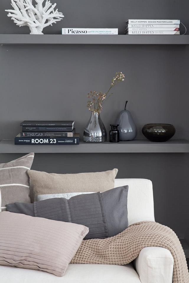
When using taupe as a key shade in your home, Kelly advises to use layers to achieve a stunning look. The scene can be divided into three sections; the mesmerising display of mirrored vases on the window sill, the embellished Oxford cushions placed on the sofa, and the small display of cut glass bowls and vases on the table in front. The combination of all of these elements creates a gorgeous layered design.
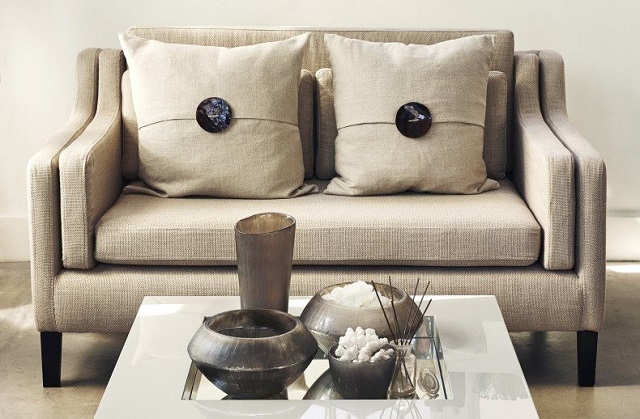
Simplicity is the key to this effective interior style. Simple and subtle layers of textural contrast are used in this composition. The cushion embellished with mother of pearl and the large glass globe with the textured taupe coloured band at the top add interest. Including four different neutral coloured scented candles beautifully completes the scene.

Knightsbridge Flock Taupe Wallpaper
This luxurious geometric flock wallpaper in Kelly’s signature taupe has clean lines and a simple dual colour aesthetic to suit any room.
Create a sense of beauty and luxury in the bedroom by using multiple layers of contrasting textures. Taupe and white work beautifully together to create a fresh and harmonious look.

Taupe lends itself brilliantly to creating layers of contrast. The calming linear dimension of this bedspread is given additional contrast by the inclusion of embellished taupe cushions. Further balance and harmony is added by the displays featured on either side of the bed continuing and enhancing the taupe colour scheme. The key to the art of display is to sometimes use less and to not overfill the space. The space around the objects is as important as the objects themselves. A few simple items with a connecting theme, like these organic shapes, can make a display with the greatest impact.
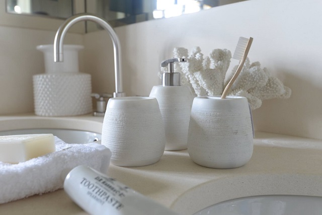
Taupe is a great colour choice for your bathroom – as well as being a cool and sophisticated tone, it’s also very calming. I hope this blog has inspired you to go taupe – which is your favourite look? For regular discount code and sale updates, follow us on Facebook!
Natalia xo

I think taupe is great as a backdrop. It’s a very versatile colour to work with because it goes well with any other colour. The problem I think many people have is that they don’t do enough texture contrasting with it. It’s so easy to slip into having all taupe and white interior which lacks personality and can be looking quite sterile and clinical, instead of being relaxing and calming. As Kelly Hoppen says you need loads of texture to balance the scheme out, and to make it more personal and unique. Great art or a bolder rug would make so much more difference to otherwise quite muted interior. I think design is about expressing your personality so don’t be afraid to put yourself into it, if you feel it works for you.